With an ever increasing diversity of browsing devices available to users, it is becoming more and more difficult to forecast what the future of web browsing will be - so it's important your website is flexible.
We have already seen trends change from predominantly desktop browsing, to mobile browsing while users are one the go. The mobile user demands the same feature rich content as the desktop user, but with limited screen real-estate, the information needs to be provided in the most user friendly layout for the device on which the website is being viewed.
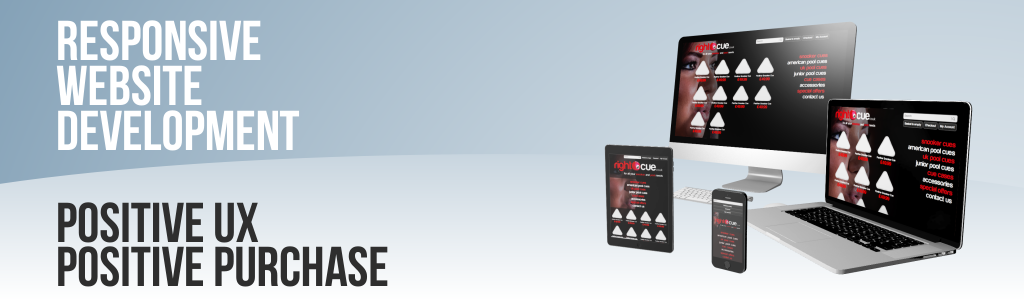
CSS3 media queries allow us to flow website content based on the size of the users screen. This fluid approach allows the most suitable design to be served up for that exact screen resolution; leaving no gaps or crashed graphics. We can even specify the size of interactive features based on the screen size for mobile browsers with small viewing areas so that navigating the website does not become cumbersome for the mobile user as the website reduces in size.
It is important that your website engages with as wide an audience as possible in order to catch the attention of those users who are searching for your products and services. Responsive web development is a way in which, no matter what the user might come across your website on, they can easily locate the information they require and gain trust in your brand through your website as a first point of contact.